What’s happening at Clarify
Clarifying best practices, tool stacks, and strategies.
Featured

What I’ve learned about being a founder on LinkedIn
How founders like me use LinkedIn as their “golden goose.”


How to run a sales call (in the early days)
The best sales calls don’t feel like sales calls at all — they’re discovery sessions. When you treat early conversations as continuous learning loops, you might not close deals right away, but you’ll uncover something far more valuable: direction.

When to hire sales (and how to do it)
The founder’s instinct is to hire sales too soon — but the real advantage comes from selling yourself until the motion is repeatable.

The mindset shifts needed for successful founder-led sales
Losing Carta early at my first startup taught me a painful but lasting lesson: sales isn’t optional for founders—it’s the fastest way to discover the truth about your market.

Clarify raises $22.5m and is now generally available
Read the note from our founders, Pat, Austin, and Ondrej to hear more about the funding, the vision for starting Clarify, and what's next.

Recent posts
- Cold email templates by sales stage: Examples, personalization, and follow-up

- Agents: Automate any CRM workflow with a prompt
- Sales follow-up emails: How to write them, when to send, and what to include
- The sales cycle, stage by stage: Where it breaks and how to fix it
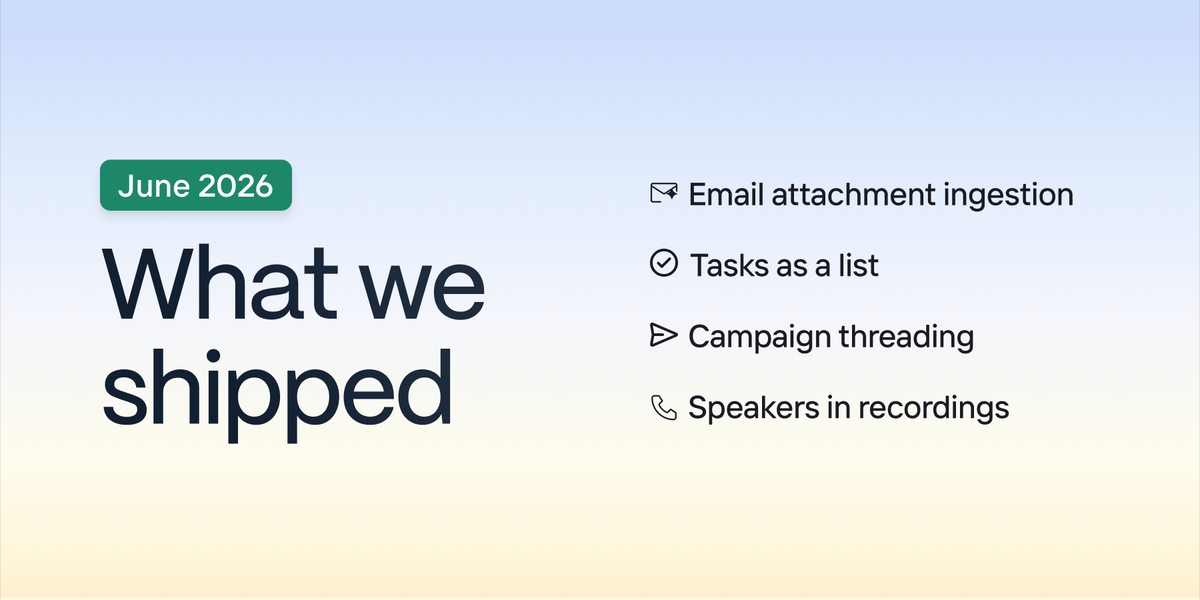
- New in Clarify: June 2026
- Weekly ship notes: 6/12
- Weekly ship notes: 6/5
- Weekly ship notes: 5/29
- CRMs that integrate with Claude: A practical guide for 2026
- The best CRMs that integrate with Slack in 2026
- What's the best CRM for ChatGPT? 10 platforms compared
- CRM best practices for early-stage sales teams
- Cut admin, not corners: The best AI CRM for founders and startups
- Weekly ship notes: 5/22
- The 12 best investor CRMs for VC, PE, and IR teams