Top Reporting Features to Enhance Your Data Analysis

Top Reporting Features to Enhance Your Data Analysis
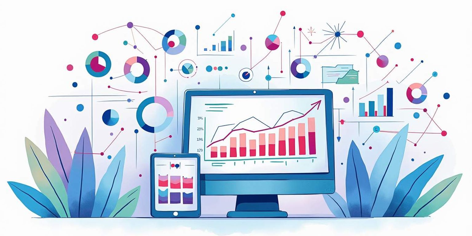
In today's data-driven world, the ability to analyze and interpret data effectively is crucial for businesses aiming to make informed decisions. reporting features play a pivotal role in transforming raw data into meaningful insights. This article explores the top reporting features that can significantly enhance data analysis, enabling organizations to harness the full potential of their data.
1. Interactive Dashboards
Interactive dashboards serve as a centralized hub for data visualization, allowing users to explore data through various visual elements such as charts, graphs, and maps. These dashboards provide a real-time overview of key performance indicators (KPIs), making it easier for stakeholders to monitor progress and identify trends.
With the ability to drill down into specific data points, users can gain deeper insights into their metrics. This feature not only enhances understanding but also promotes data-driven decision-making across departments.
Customization Options
One of the standout features of interactive dashboards is the level of customization they offer. Users can tailor the layout, choose specific metrics to display, and even adjust the visual style to align with their brand identity. This flexibility ensures that the dashboard is not only functional but also visually appealing.
Moreover, customization allows teams to focus on the metrics that matter most to them, streamlining their data analysis process and making it more efficient.
Real-Time Data Updates
Another significant advantage of interactive dashboards is their ability to provide real-time data updates. This feature is essential for businesses that require up-to-the-minute information to make timely decisions. By integrating with various data sources, dashboards can automatically refresh, ensuring that users always have access to the latest insights.
This capability is particularly beneficial in fast-paced industries where conditions can change rapidly, enabling teams to respond promptly to new developments.
2. Advanced Filtering and Segmentation
Advanced filtering and segmentation capabilities allow users to dissect their data in various ways, leading to more granular insights. By applying filters, users can isolate specific data sets based on criteria such as time periods, geographic locations, or customer demographics.
This feature is invaluable for identifying patterns and trends that may not be apparent in aggregated data. For instance, a marketing team can analyze the performance of a campaign across different customer segments, helping them tailor future strategies more effectively.
Dynamic Filtering
Dynamic filtering takes this a step further by enabling users to interactively adjust filters on the fly. This means that as users explore their data, they can instantly see the impact of different filters without needing to run separate reports. This immediacy fosters a more exploratory approach to data analysis, encouraging users to ask questions and seek answers in real time.
Segmentation for Targeted Insights
Segmentation allows businesses to categorize their data into distinct groups, making it easier to analyze specific segments. For example, a sales team might segment their data by region or product line to understand performance variations. This targeted approach leads to more actionable insights, as teams can focus on the factors driving success or hindering performance within each segment.
3. Automated Reporting
Automation in reporting is a game-changer for organizations looking to save time and reduce manual errors. Automated reporting tools can generate reports on a scheduled basis, delivering insights directly to stakeholders without requiring manual intervention.
This feature not only enhances efficiency but also ensures that decision-makers have access to consistent and timely information. With automated reporting, teams can focus their efforts on analysis and strategy rather than data compilation.
Scheduled Reports
Scheduled reports allow users to set specific times for reports to be generated and distributed. This ensures that stakeholders receive regular updates without having to request them manually. For instance, a weekly sales report can be automatically sent to the sales team every Monday morning, keeping everyone informed and aligned on performance metrics.
Alerts and Notifications
In addition to scheduled reports, automated reporting systems can also send alerts and notifications based on predefined criteria. For example, if a KPI falls below a certain threshold, the system can automatically notify relevant team members. This proactive approach enables organizations to address issues promptly and maintain optimal performance.
4. Data Visualization Tools
Data visualization is at the heart of effective reporting. Visualization tools transform complex data sets into easily digestible visual formats, making it simpler for users to understand trends and patterns. Whether through bar charts, line graphs, or heat maps, effective visualizations can convey insights that might be missed in raw data.
Moreover, the right visualization can highlight relationships between variables, helping teams identify correlations and causations. This clarity is essential for making informed decisions based on data.
Variety of Visualization Options
Offering a variety of visualization options is crucial for catering to different analytical needs. Users should have the flexibility to choose the most appropriate visualization for their data. For instance, a line graph may be ideal for showing trends over time, while a pie chart might be more effective for illustrating proportions within a whole.
By providing a range of visualization types, organizations can ensure that their data is presented in the most impactful way possible, enhancing understanding and engagement.
Interactive Visualizations
Interactive visualizations take data presentation to the next level by allowing users to engage with the data directly. Users can hover over data points for more information, zoom in on specific areas, or filter data directly within the visualization. This interactivity encourages exploration and deeper analysis, making it easier for users to uncover insights.
5. Collaboration Features
In a world where teamwork is essential, collaboration features in reporting tools can significantly enhance data analysis. These features allow multiple users to work together seamlessly, sharing insights and findings in real time.
Collaboration tools can include shared dashboards, commenting capabilities, and version control, ensuring that everyone involved in the analysis process is on the same page. This collective approach fosters a culture of data-driven decision-making across the organization.
Shared Dashboards
Shared dashboards enable teams to work collaboratively on data analysis. By granting access to specific dashboards, team members can view and interact with the same data, facilitating discussions and joint decision-making. This transparency ensures that everyone has access to the same information, reducing the likelihood of miscommunication.
Commenting and Feedback
Commenting features allow users to leave notes and feedback directly on reports and dashboards. This capability encourages dialogue around the data, enabling team members to ask questions, share insights, and suggest improvements. This collaborative environment enhances the overall quality of analysis and decision-making.
6. Integration with Other Tools
Integration capabilities are vital for modern reporting tools, as they allow organizations to connect their reporting systems with other software solutions. Whether it's a CRM, marketing platform, or financial software, seamless integration ensures that data flows smoothly between systems, enhancing the overall analysis process.
For instance, integrating reporting tools with a CRM like Clarify can provide invaluable insights into customer behavior, sales performance, and marketing effectiveness. This holistic view of data empowers organizations to make more informed decisions based on a comprehensive understanding of their operations.
Data Import and Export
Robust data import and export functionalities are essential for effective integration. Users should be able to easily import data from various sources, including spreadsheets, databases, and APIs. Likewise, exporting reports in different formats (such as PDF, Excel, or CSV) allows for easy sharing and presentation of insights.
API Connectivity
API connectivity is another critical aspect of integration. By leveraging APIs, organizations can automate data transfers between systems, ensuring that reporting tools always have access to the latest data. This connectivity reduces the need for manual data entry and minimizes the risk of errors, ultimately enhancing the accuracy of reports.
7. Predictive Analytics
Predictive analytics is an advanced reporting feature that uses historical data to forecast future trends. By applying statistical algorithms and machine learning techniques, organizations can gain insights into potential outcomes, helping them make proactive decisions.
This feature is particularly valuable for businesses looking to stay ahead of the competition. For example, a retail company can use predictive analytics to anticipate customer demand, optimizing inventory levels and reducing costs.
Trend Analysis
Trend analysis is a key component of predictive analytics. By examining historical data trends, organizations can identify patterns that may indicate future behavior. This foresight enables teams to develop strategies that align with anticipated market conditions, enhancing their competitive edge.
Scenario Modeling
Scenario modeling allows organizations to simulate different outcomes based on varying inputs. By adjusting variables, teams can explore how changes in one area might impact overall performance. This capability is invaluable for strategic planning, enabling organizations to evaluate the potential effects of different decisions before implementation.
8. User-Friendly Interface
A user-friendly interface is essential for any reporting tool. If users find the interface confusing or difficult to navigate, they are less likely to engage with the tool effectively. A clean, intuitive design enhances the user experience, making it easier for individuals to access the information they need.
Moreover, a user-friendly interface reduces the learning curve for new users, allowing teams to adopt the tool more quickly and efficiently. This accessibility is particularly important in organizations where team members may have varying levels of technical expertise.
Drag-and-Drop Functionality
Drag-and-drop functionality is a feature that enhances usability by allowing users to easily rearrange elements within a dashboard or report. This intuitive approach enables users to customize their views without needing extensive training or technical knowledge.
Guided Tutorials and Support
Providing guided tutorials and support resources is another way to enhance the user experience. These resources can help users understand how to leverage the reporting tool effectively, ensuring they can maximize its potential. Comprehensive documentation, video tutorials, and responsive customer support can significantly improve user satisfaction and engagement.
Conclusion
Incorporating advanced reporting features into data analysis processes can significantly enhance an organization's ability to make informed decisions. From interactive dashboards and advanced filtering to automated reporting and predictive analytics, these features empower teams to extract valuable insights from their data.
As organizations continue to navigate the complexities of the modern business landscape, leveraging these reporting capabilities will be essential for staying competitive. By embracing tools that facilitate collaboration, integration, and user-friendly experiences, businesses can unlock the full potential of their data, driving growth and success.
Ultimately, investing in robust reporting features is not just about improving data analysis; it's about fostering a culture of data-driven decision-making that can propel organizations toward their strategic goals.
Transform Your Data Analysis with Clarify
Ready to take your data analysis to the next level? Discover the power of Clarify and unlock the full potential of your customer data. Our AI-driven CRM platform is designed to streamline your workflows, provide deep insights, and enhance decision-making with ease. Don't miss out on the opportunity to elevate your business with a CRM that's as intuitive as it is powerful. Request access today and experience the future of customer relationship management.
Get our newsletter
Subscribe for weekly essays on GTM, RevTech, and Clarify’s latest updates.
Thanks for subscribing! We'll send only our best stuff. Your information will not be shared and you can unsubscribe at any time.