Choosing the Right CRM Colors: A Guide to Enhance User Experience

Choosing the Right CRM Colors: A Guide to Enhance User Experience
Choosing the Right CRM Colors: A Guide to Enhance User Experience
In the realm of customer relationship management (CRM), the user interface plays a crucial role in determining how effectively users can navigate and utilize the software. One often overlooked aspect of UI design is color choice. The colors used in a CRM can significantly impact user experience, influencing everything from readability to emotional response. This guide explores how to choose the right colors for a CRM, with a particular focus on enhancing user experience.
The Psychology of Color in User Interfaces
Color psychology is a fascinating field that examines how colors affect human emotions and behaviors. When designing a CRM, understanding the psychological effects of colors can help create a more engaging and effective user experience.
Emotional Responses to Colors
Different colors evoke different emotions. For instance, blue is often associated with trust and professionalism, making it a popular choice for corporate settings. Green can evoke feelings of growth and tranquility, while red may stimulate urgency or alertness. When selecting colors for a CRM, it is essential to consider the emotions you want to evoke in your users.
Moreover, the target audience plays a significant role in color selection. A CRM designed for a financial institution may lean towards more subdued, professional colors, whereas a CRM aimed at a creative agency might utilize bolder, more vibrant hues. Additionally, cultural differences can influence color perceptions; for example, white is often associated with purity in Western cultures but can symbolize mourning in some Eastern cultures. Thus, understanding the cultural context of your users can further refine color choices and enhance user engagement.
Color Combinations and Accessibility
While individual colors are important, the combinations used can be equally impactful. A well-thought-out color palette can create a cohesive look that enhances usability. However, accessibility must also be a priority. Color blindness affects a significant portion of the population, so ensuring that color combinations provide enough contrast is crucial for readability.
Tools like contrast checkers can help designers ensure that their color choices are accessible to all users. This consideration not only improves user experience but also demonstrates a commitment to inclusivity. Furthermore, incorporating patterns or textures alongside colors can provide additional visual cues for users with color vision deficiencies, allowing them to navigate the interface more effectively. By prioritizing accessibility in color design, you not only expand your user base but also foster a more welcoming environment for all individuals, regardless of their visual capabilities.
Implementing Color Theory in CRM Design
Color theory provides a framework for understanding how colors interact with one another. By applying these principles, designers can create visually appealing and functional CRM interfaces.
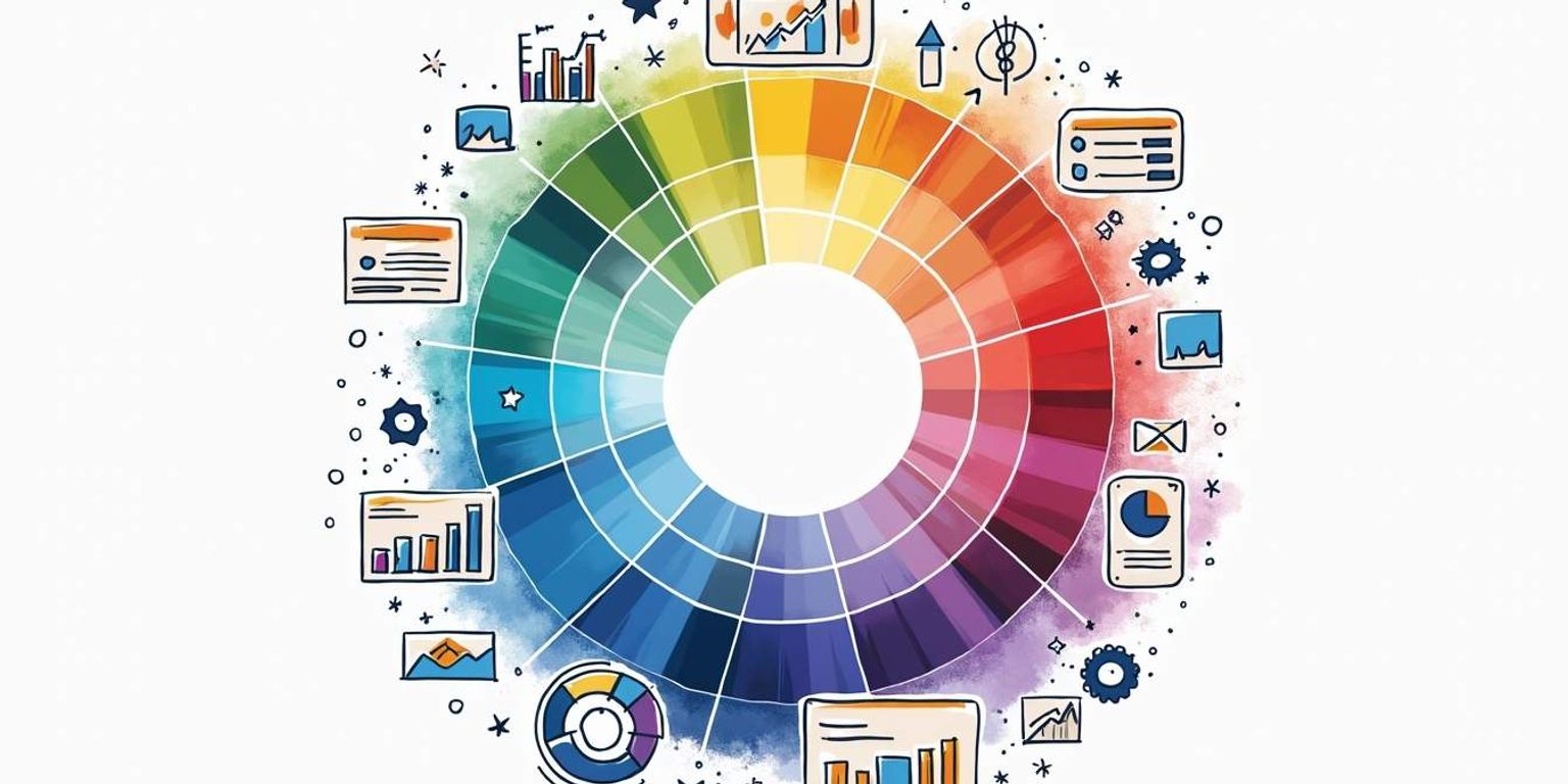
The Color Wheel and Harmonious Palettes
The color wheel is a fundamental tool in color theory, showcasing primary, secondary, and tertiary colors. Utilizing complementary colors—those opposite each other on the wheel—can create striking contrasts that draw attention to important features within the CRM.
Analogous colors, found next to each other on the wheel, can create a more harmonious and soothing interface. This approach can be particularly effective in areas where users will spend a lot of time, such as dashboards or data entry forms. For instance, a gradient that transitions smoothly from a soft blue to a gentle green can evoke feelings of calmness and focus, encouraging users to engage more deeply with the data presented. Additionally, incorporating neutral tones can help balance vibrant colors, ensuring that the interface remains user-friendly and not overwhelming.
Branding and Color Consistency
For any CRM, aligning colors with branding is essential. A consistent color scheme not only reinforces brand identity but also fosters familiarity among users. When users can easily associate colors with specific functions or features, their overall experience improves.
Clarify, as a next-generation CRM, emphasizes the importance of branding through color. By integrating brand colors into the interface, users can navigate the system with ease, feeling a sense of connection to the brand itself. Furthermore, the strategic use of color can also enhance user engagement by creating visual cues that guide users through various tasks. For example, using a specific shade to highlight actionable items or notifications can prompt users to take necessary actions without feeling lost in a sea of information. This thoughtful application of color not only aids in usability but also reinforces the brand’s message and values, creating a cohesive experience that resonates with users on multiple levels.
Color Selection for Different CRM Features
Different features within a CRM may require different color approaches. Understanding how to tailor color choices to specific functionalities can enhance user experience significantly.
Dashboard Design
The dashboard serves as the central hub for users, providing quick access to vital information. Colors used in dashboard design should facilitate easy navigation and quick comprehension of data. Neutral backgrounds with bold accent colors can help highlight key metrics without overwhelming the user.
Using color to indicate performance—such as green for success and red for alerts—can also provide immediate visual cues that aid in decision-making. This approach aligns with the goal of creating a user-friendly interface that enhances productivity. Furthermore, incorporating softer shades for less critical information can create a visual hierarchy, allowing users to prioritize their focus on what truly matters. A well-designed dashboard not only improves user engagement but also fosters a sense of control and clarity in managing tasks and responsibilities.
Data Visualization
Data visualization is another critical area where color choice can significantly impact user experience. Charts, graphs, and other visual aids rely heavily on color to convey information effectively. Using a consistent color scheme across visualizations helps users quickly interpret data and identify trends.
Incorporating color gradients can also enhance data representation, allowing users to see variations in data more clearly. However, it is essential to ensure that these gradients are accessible and do not confuse users with color blindness. Additionally, providing alternative text descriptions or patterns can further enhance accessibility, ensuring that all users can derive insights from the visual data. The strategic use of color not only aids in comprehension but also adds an aesthetic quality to the CRM, making the data more engaging and less intimidating. This can encourage users to interact more with the data, leading to deeper insights and more informed decision-making.
Testing and Iteration: The Key to Success
Choosing the right colors for a CRM is not a one-time task. It requires ongoing testing and iteration to ensure that the color scheme effectively meets user needs. The visual appeal of a CRM can significantly influence user engagement and satisfaction, making it essential to approach color selection as a dynamic process rather than a static decision.
User Feedback and A/B Testing
Gathering user feedback is crucial in understanding how color choices impact user experience. Conducting surveys or interviews can provide insights into how users perceive the colors used in the CRM. Additionally, A/B testing different color schemes can help identify which combinations resonate best with users. This method allows designers to compare user interactions with varying designs, leading to data-driven decisions that enhance usability and aesthetic appeal.
By analyzing user interactions and preferences, designers can make informed decisions about color adjustments, ultimately leading to a more effective CRM interface. Furthermore, incorporating analytics tools can help track user behavior and engagement metrics, providing deeper insights into how color influences actions such as navigation, task completion, and overall satisfaction. These insights can be invaluable in refining the user experience and ensuring that the CRM remains intuitive and user-friendly.
Staying Updated with Trends
Color trends in design are constantly evolving. Staying informed about current trends can help ensure that a CRM remains modern and appealing to users. Following design blogs, attending webinars, and participating in design communities can provide valuable insights into emerging color palettes and styles. Engaging with other professionals in the field can also spark creativity and inspire innovative approaches to color application.
Clarify, as a next-generation CRM, is committed to staying ahead of the curve by continually refining its color choices based on user feedback and industry trends. This dedication to improvement ensures that users always have a positive experience. Additionally, by leveraging tools like mood boards and color theory workshops, designers can explore how different colors evoke emotions and influence user behavior, further enhancing the CRM's design strategy. The interplay of color psychology and user experience is a fascinating area that can lead to groundbreaking advancements in CRM design, making it a vital focus for ongoing development.
Conclusion: The Impact of Color on CRM Success
Choosing the right colors for a CRM is a multifaceted process that requires careful consideration of psychology, theory, and user experience. By understanding the emotional responses to colors, implementing color theory principles, and continuously testing and iterating, designers can create a CRM that not only looks appealing but also enhances user experience.
As the landscape of CRM continues to evolve, tools like Clarify demonstrate the importance of thoughtful design in building user-friendly interfaces. By prioritizing color selection, businesses can foster better relationships with their users, ultimately leading to greater success.
In the end, color is more than just an aesthetic choice; it is a powerful tool that can influence user behavior and satisfaction. By harnessing the potential of color in CRM design, organizations can create environments that empower users and drive productivity.
Transform Your CRM Experience with Clarify
Ready to elevate your customer relationship management with a palette of powerful features and a user interface that delights? Request access to Clarify today and discover how our AI-driven platform can streamline your workflows, provide valuable insights, and grow your business with a CRM that's as efficient as it is aesthetically pleasing. Join Clarify for a seamless, unified, and engaging experience that puts color theory into practice for your success.
Get our newsletter
Subscribe for weekly essays on GTM, RevTech, and Clarify’s latest updates.
Thanks for subscribing! We'll send only our best stuff. Your information will not be shared and you can unsubscribe at any time.